UPDATE: My setup changed between writing this and Halloween 2025. Updates and complete description, including revisions are in my later post.
Next Halloween, my setup will include three coordinated skeletons performing together (probably doing “King Tut“). I want to use a single PIR motion detector to trigger three different props at different offsets from the original trigger. And some of the props can only speak or move for short amounts of time, so for a longer performance, they need to be repeatedly triggered. To do this, I have a PIR providing input to a Raspberry Pi Zero W. A python program running on the Pi then sends brief output trigger voltages individually to each of the props, according to the preset schedule for the routine. This same approach could easily be modified to trigger 2, 4, 5, or more coordinated props from a single start trigger. The hardware setup is very simple, and is shown in the figure.
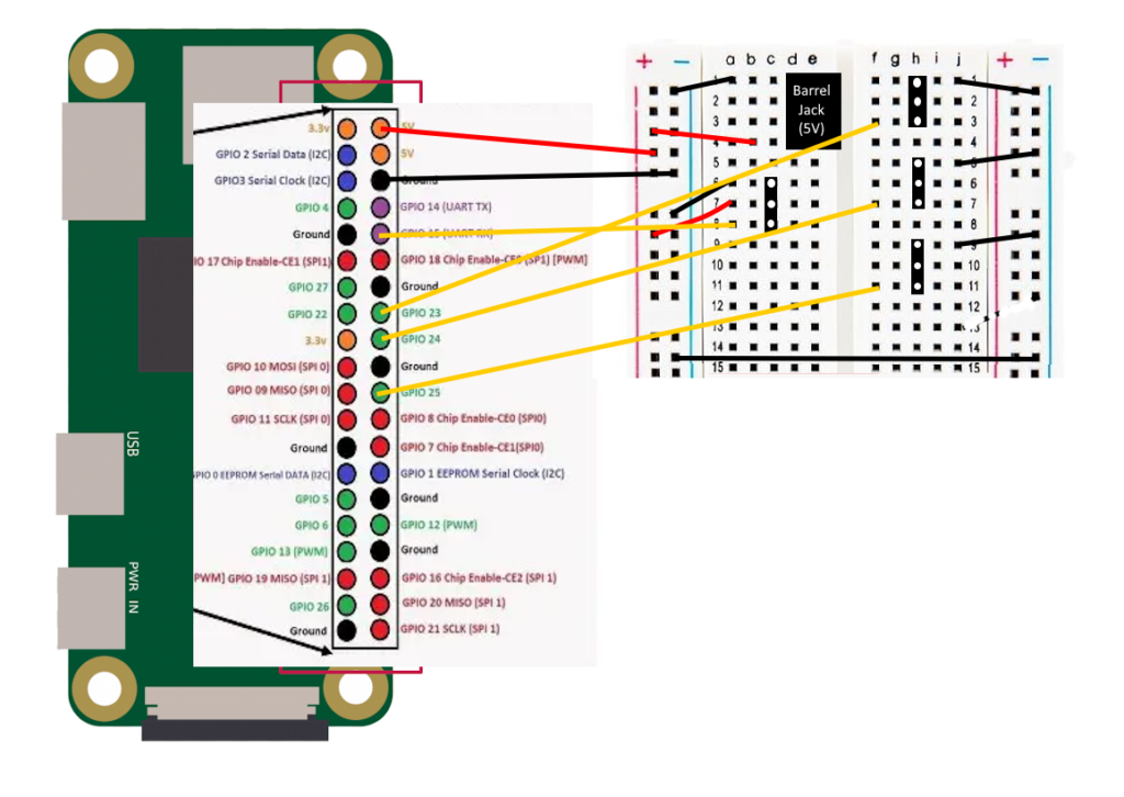
Wiring diagram
Power is provided via the barrel jack on the prototype board. This is also what powers the Pi. Their are four 3-pin female headers on the board. The one on the left is for the PIR sensor input. It has the power and ground connections, and the signal wire is an input that goes to GPIO pin 15 on the Pi. The other three headers are to go out to the three props. The grounds are connected so that the prop controls and this trigger share a common ground. The signal connections are outputs from GPIO pins 23, 24, and 25. There is no need for power for these connections.
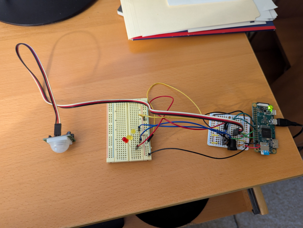
In order to test the hardware, I rigged up one LED to each of the three signal outputs, put a resistor in to avoid burning out any of the LEDs, and linked the grounds. The test setup is shown below below:
Test setup to make sure the hardware works and that I got the soldering correct.
I used the GPIO Zero library to write a simple test script for this test setup:
from gpiozero import LED
from gpiozero import MotionSensor

myLED1 = LED(23)
myLED2 = LED(24)
myLED3 = LED(25)
pir = MotionSensor(15)

while True:
    if pir.wait_for_motion():
        print("motion detected")
        myLED3.off()
        myLED1.blink(1)
        myLED2.blink(2)
        pir.wait_for_no_motion()
        print("no motion")
        myLED1.off()
        myLED2.off()
        myLED3.blink(3)
This has the pi wait until the PIR detects motion. Then it begins blinking the first 2 LEDs at different rates. When motion stops, those two LEDs are turned off and the third LED begins to blink. This cycle then repeats until the user hits CTRL-C to stop the test script.
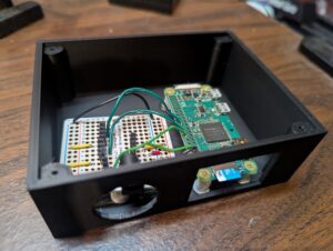
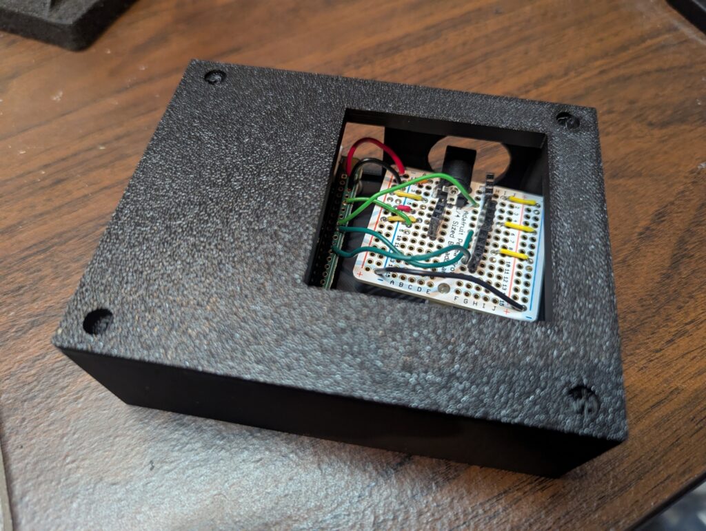
Completed electronics in project box
Completed project box with electronics inside and lid on the top
The circuit is mounted in a custom 3d printed project box with slots for the power, sensor, and output wires, as well as a slot for accessing the Pi’s micro SD card. I designed the box using TinkerCad. I also 3d printed the standoffs, and just used hot glue to glue the Pi and the breadboard in place. I put in large holes so that it would be easy to plug and unplug the connectors and also get my fingers in to insert or remove the micro SD card. The top has a large cutout to make it easy to access the 3-pin headers. The finished hardware is shown in the figures on the right.
I’m mostly retired, but still consult a bit in my field: Intelligent Transportation Systems (the use of advanced sensors, communications and information processing systems to improve ground transportation). The field includes connected and automated vehicles. And out of intellectual curiosity, I’ve also been learning about sentiment analysis. So I decided to combine these interests by tracking the change in sentiment over time, about automated vehicles, using tweets as the source material. And while I was at it, I figured I’d do the same thing for electric vehicles, and publicly display the results on two web pages.
One of the common, basic approaches to sentiment analysis is to determine whether the general tone of a sample of text is positive, negative, or neutral. That is the approach that I’ve taken. To determine this, one can use a rules-based approach, where certain words and word combinations are assigned tones and intensity (e.g., “hate” is very negative, “cool” is positive, “not cool” is negative). The scores for each sentiment word are combined to get an overall sentiment for the text sample. The other approach is to use machine learning algorithms to determine the sentiment. This approach can be more flexible, but requires a lot of training data, and the training data must be tagged by humans. In addition, multiple humans should review each sample, as studies have shown that humans can disagree with one another 20% of the time when assigning sentiment to a text sample.
I decided to use tweets posted on Twitter as the source material, since there are a large number of new entries every day and Twitter provides a free API that allows one to sample thousands of tweets per day, filtered by keywords and other parameters.
Once each tweet is assigned a sentiment value, I look at several metrics based on the total numbers of positive, negative, and neutral tweets. In addition, I extract and save the 100 most common 1 word and 2-word combinations found in the set of tweets for the day. The results are then used to generate several metrics, plots, and displays for the web pages.
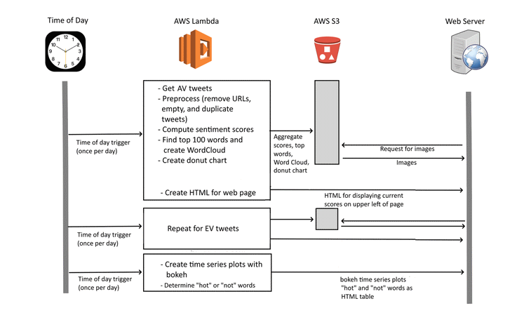
The overall system for data collection, analysis, and display is shown…
Swim diagram for this project analyzing the sentiment of tweets about AVs and EVs and publishing the results on a web page
Getting and Filtering Tweets
The first step is to get the relevant tweets and clean and filter them. Two almost identical programs are used, one for AV tweets and one for EV tweets. The reason these are not combined into a single program is that this would exceed the 15 minute access limit of Twitter’s API. Instead, each is run once, about an hour apart, during the middle of the night eastern standard time.
Twitter’s free “Essentials” access level lets one search through a sample of tweets that were posted in the last 7 days. In order to access the twitter API, one must first register. Then, I used tweepy, a free python library for accessing the Twitter API. The search query API provides for a large number of query parameters. For this project, I searched for tweets containing any of a list of key words and that were not retweets, replies, or quote tweets (i.e., only original tweets are included).
The search terms were selected to try to broadly collect relevant tweets, but to avoid accidentally capturing a significant number of irrelevant ones. For example, the AV search terms include “self driving,” “automated vehicles,” and “automated shuttles” but does not include “Tesla,” as many tweets with the word Tesla are about the stock price or other aspects of the company, not about autonomous vehicles.
The next steps filtered out empty tweets and remove URLs from the tweet contents. During development, manual inspection revealed a large number of identical or nearly identical tweets, mostly originating from bots that pick up and tweet news stories. Therefore a filter was set up to keep only one sample from these duplicates and near-duplicates. To remove exact duplicates I simply used the drop_duplicates method in pandas. Removing near duplicates proved more problematic. The basic approach is to assess the similarity between pairs of tweets, and if they are sufficiently similar, remove one of them. Unfortunately this involves comparing every tweet with every other tweet, and there are thousands of tweets. I found that efficiently iterating through the tweets required the use of pandas’ itertuples method. This was at least an order of magnitude faster than using iterrows or items methods. Even so, the first similarly library I tried to use, SequenceMatcher, took over 10 minutes to perform all the comparisons! In the end, I used the Levenshtein.normalized_similarity method from the RapidFuzz library. This brought the runtime down to seconds.
Sentiment Analysis
The filtered and cleaned up tweets were now each analyzed to determine the sentiment of the tweets. I experimented with a number of approaches and settled on using VADER, an open-sourced, rule-based tool for sentiment analysis, written in Python. VADER was specifically developed to analyze short social media posts, such as tweets. In addition, it runs very quickly, which is useful as I analyze thousands of tweets at a time on each of the two subjects.
I made two very minor changes to the VADER code. First, as reported in the “issues” on GitHub, some words are listed more than once in it’s dictionary, with differing sentiment values. For these, I used my best judgement on which to keep and discarded the duplicates. In addition, VADER lets the user add their own words to its dictionary of sentiments. Based on manual review of a large number of tweets, some additional words tailored to the subject matter were added and assigned sentiments:
“advances”: 1.2
“woot”: 1.8
“dystopia”: -2.5
“dystopian”: -2.5
“against”: -0.9
“disaster”: -2.5
Sentiment Metrics
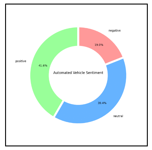
Donut Chart showing the current day’s sentiments by percentage.
Once the sentiment of each tweet is determined, the results are aggregated. The total numbers of negative, positive, and neutral counts are calculated and stored in an AWS S3 storage bucket. Using matplotlib’s pyplot, a donut graph is created showing the percentages for each type of sentiment, and the graph is also stored in an S3 bucket for display on the web pages.
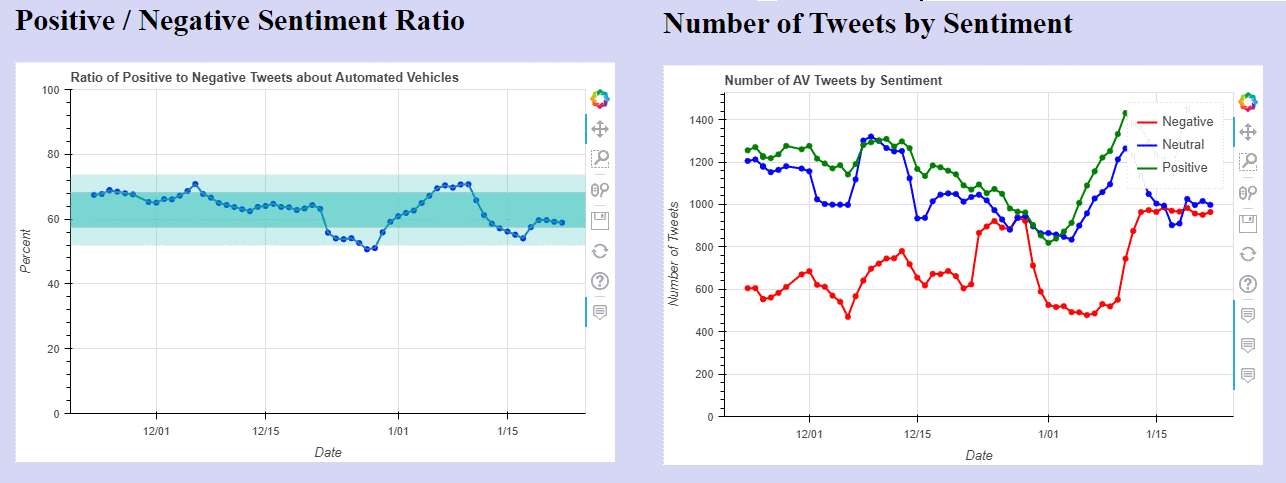
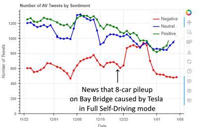
Two indices are also calculated: the ratio of the number of positive to negative tweets, ignoring neutral tweets, and the index, which is the average value, with each negative tweets counting as -1, neutral tweets as 0, and positive tweets as +1. These scores are put into an HTML fragment and transferred to the web server for incorporation into the two sentiment indices web pages.
Word Cloud
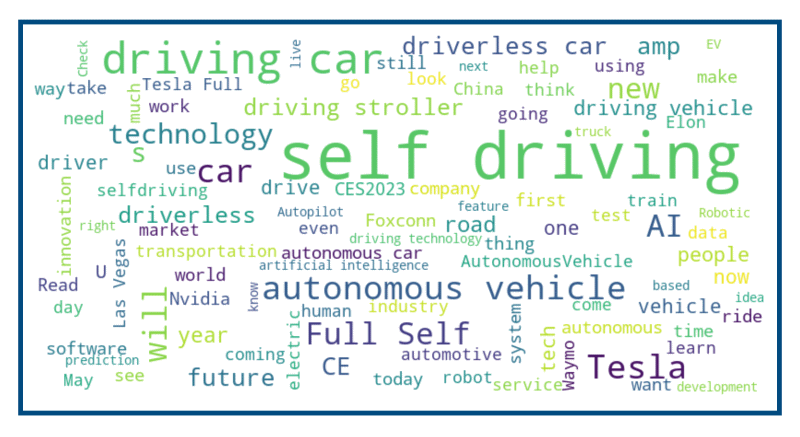
Word Cloud showing the 100 most common 1 and 2 word combinations
In addition to calculating the sentiment indices, the 100 most common single and two-word combinations are determined for the current days tweets. A word cloud image is also generated. Both of these are done using the WordCloud library. Both the word list and the Word Cloud are written out to one of the S3 buckets.
Time Series Charts with Bokeh
After both of the sentiment analysis programs are run each day, a single additional program is run. This program has two functions, each of which operate separately on the AV and EV data. First, it produces two time series plots of the sentiment indices, using the data stored in one of the S3 buckets. Second, it uses the most common words stored in S3 bucket and compares them with the list that was stored in the bucket 7 days ago. Words that appear in the most common 100 for the current day, but not the day a week ago are determined (“hot” words), as well as those that were on the list 7 days ago, but not today (“not” words). A subset of the list is then formatted into an HTML table for display on the web pages.
Bokeh is used to generate the two time series plots. I used bokeh rather than matplotlib because I wanted some interactivity on the web page, and Bokeh is a Python library for creating interactive visualizations for web browsers. The actual web scripts that Bokeh generates are in javascript.
This was my first time using Bokeh. It wasn’t hard to figure out how to generate the basic time series plots that I wanted, or to add the “hover” tool to allow one to see the value of particular data points. However, I had some trouble figuring out how to generate the results for use on a web page and then incorporating them in the page. Bokeh plots can require a server, for complex interactivity involving changing data or plots, or can be embedded as standalone plots. For this application, I used it in standalone mode. There are four modes that can be used for this, and as a beginner, I freely confess I don’t understand them well.
The file_html method returns a complete HTML document that embeds the Bokeh documents. That wouldn’t be appropriate for this application, as the Bokeh plots are embedded within other web pages. The json_item method “returns a JSON block that can be used to embed standalone Bokeh content.” I played around with this a bit, but I don’t really understand it. The components method returns “Return HTML components to embed a Bokeh plot. The data for the plot is stored directly in the returned HTML.” I didn’t explore this one at all. Finally, the autoload_static method returns “JavaScript code and a script tag that can be used to embed Bokeh Plots. The data for the plot is stored directly in the returned JavaScript code.” This is what I used. The method returns a tuple consisting of JavaScript code to be saved and a <script> tag to load it. The <script> tab is placed at the appropriate location in your HTML.
There are several ways to embed the plots in your HTML. I used a server side include, and the section of code looks like this:
Shortly after I began to capture data, the sentiment regarding automated vehicles dipped sharply for about a week, with the number of negative tweets rising sharply and the positive to negative ratio dropping 2 standard deviations below the mean. In checking what was happening, news had just broken of a major multi-vehicle crash involving a vehicle in self-driving mode. This news was clearly reflected in the negative tweets, with “hot” words that frequently occurred, but had been missing the previous week such as “Bay Bridge,” “Tesla full,” “eight car,” “eight vehicle,” and “vehicle crash.”
I’m in the process of integrating wireless audio input and into my Yorick the Mimic project. This involves adding microphone input and wireless transmission into the sensor cap and then integrating the movement controller with a modified version of Chatter Pi that takes the transmitted audio as an input.
In order to get started, I first put together bare bones transmitter and receive programs. I’m using Python, along with PyAudio, which I also used in Chatter Pi, to process the audio on both ends. I’m using UDP to send the data packets contain the audio. I saw some examples using TCP, but it seemed to me that UDP was better suited to real-time audio. If anyone knows more on which is the better approach, please post a comment.
PyAudio
The code runs fine, but generates a continuing stream of
warning messages. This doesn’t interfere with the program’s operations, but if anyone knows why I’m getting them and/or how to eliminate the warnings, I’d appreciate your letting me know.
PyAudio has two modes, a blocking mode, where each call to pyaudio.Stream.write() or pyaudio.Stream.read() blocks until all the given/requested frames have been played/recorded and a non-blocking mode where a callback function is launched in a separate thread, so that processing can continue in the program calling it, and the thread ends when the current chunk of audio is processed. The gist with my code uses the non-blocking mode using the callback function and two different versions of the receiver, one using blocking mode and one using non-blocking. You need to be careful when using the non-blocking mode that the callback function does not include anything really time consuming, like file reading and writing. If it does, it can’t finish before the next chunk of audio is ready and you get clipping or worse problems.
As is well-known, the audio jack output on a Pi produces low volume, poor quality audio. A USB speaker works much better. However at least for the speaker I’m using, I need to use the ALSAMixer to control the volume. If I touch the speaker icon in the GUI, it produces no sound if set to anything other than the maximum volume. Again, if anyone knows why and how to fix this, please add a comment.
By design, both the xmit and rcv programs run forever once started. There’s one other feature beyond the bare bones basics. The receive program has a Boolean variable named EFFECTS. If set to True, the Sox library is used to deepen the pitch and add a bit of reverb before sending the audio to the speaker.
Hopefully this project will help others with similar needs.